Gradient posts.
Stick a bit of wood to a post with some nails I thought… think again.
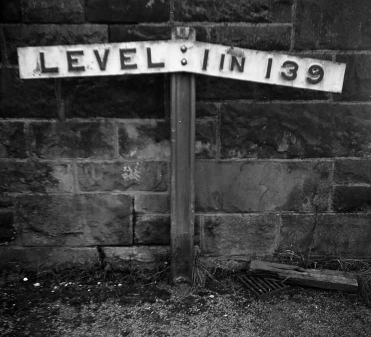
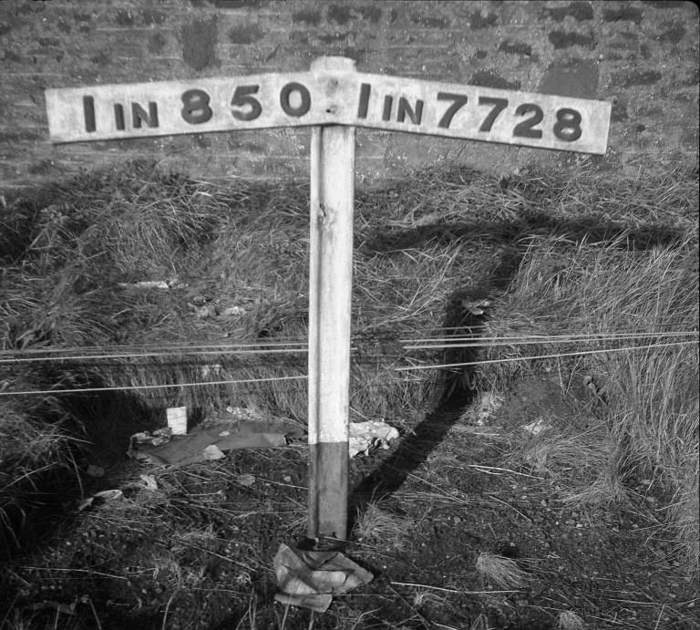
Gradient posts are signposts used on the rail network to indicate the ruling gradient to firemen and drivers. They appear beside the track and indicate the gradient and its direction (rising or falling), graphically, as a ratio.
For modern traction they are less significant than they are for steam locomotives. Steam engine crews have to consider both the demand for steam from the boiler and the water level in the boiler above the firebox crown. Having an understanding of where you can fire, where you need to add water into the boiler, and how to read the gauge glass indicating the water level, can be important to a smooth, safe journey.
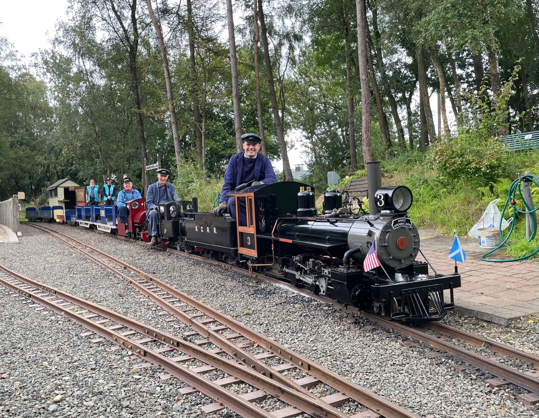
Whilst cars might think little of a 1 in 10 gradient, metal wheels on metal rail will start to struggle to keep their grip at around 1 in 50. The new tracks at Almondell have some significant gradients and will require both power and braking during any journey. This will make driving more challenging and interesting, especially with loaded trains.
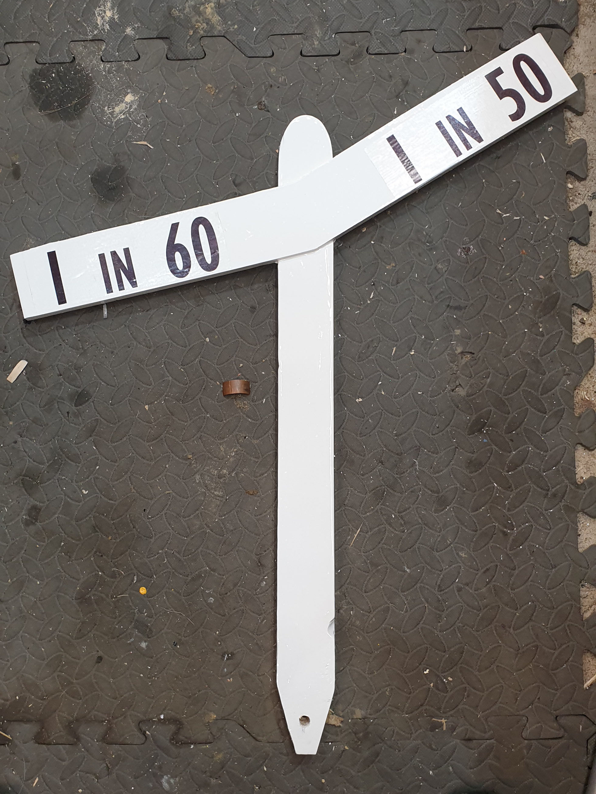
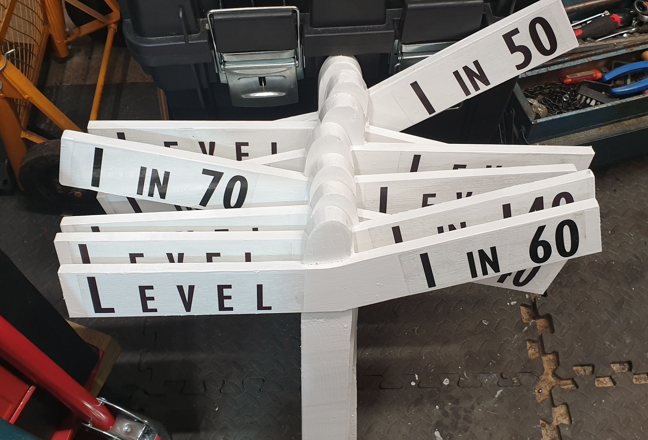
Generally, a gradient post is only used where the gradient changes. It has two arms, one indicating the gradient you’re transitioning from, and the other the gradient you are transitioning to.
I decided to make the gradient posts for the existing 7¼” Comrie circuit & Oban loops (Circuit C on the original track diagram) and having checked no-one else was already working on these, I proceeded to find a design appropriate for our track.
 Several photographs were provided and varied enormously in style. Having settled on using the Caledonian Railway (CR) as a guide, I contacted the Caledonian Railway Society via their website.
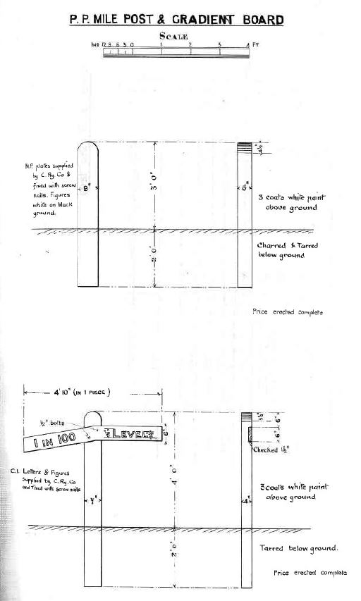 The society were incredibly helpful and provided a copy of the specifications for CR gradient posts. These differ from others, with a rounded top to the post, the use of a very simple font, and the documentation included details of painting, font sizes and measurements.
7¼” gauge is approximately 1/10th scale, but reducing a 4 foot post to 4 inches would make it highly impractical, so I decided ½ size would be appropriate, being big enough to see from a distance, and to be apparent to walkers that might trip over them, but small enough not to look out of place at our track.
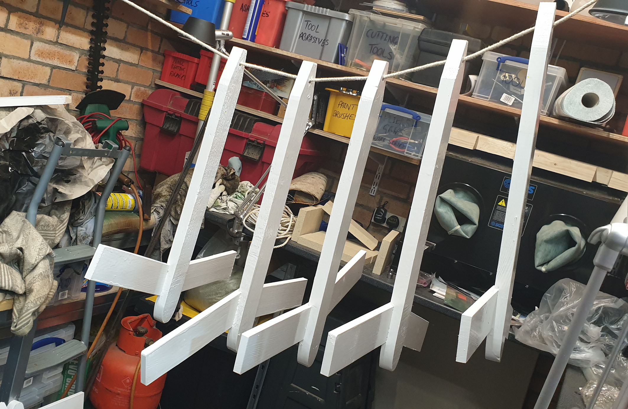
I started with some readily available rough timber around 4’ long, 2” wide by 1” thick and cut these lengths in half. I tapered one end to make it easier to knock them into the ground and rounded the other end with the assistance of a belt sander. These would form the posts, sticking out of the ground by 12”-15”.
The CR design indicated the arms were recessed into the post by 1½ inches. I scaled this down to around 8mm on my posts and used a router bit in my milling machine to cut a suitably sized recess.
Rather than make two separate arms, I decided to use 12mm thick planed timber, about 7” across, and mark out a shape that included both arms, with a standard angle in the middle. These can be mounted on the post as required to indicate the change of gradient.
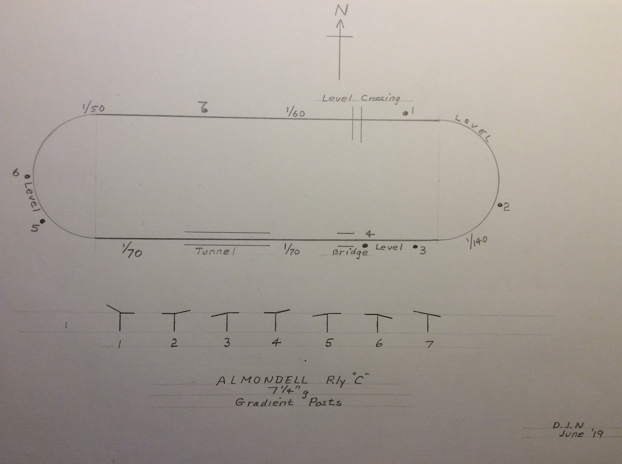 So, to the track. What gradients do I need to indicate, and where do the gradients change? Who better to ask than our resident surveyor, David Neil. David agreed to assist, writing down the gradients on a diagram of the track and after a walk round the track I noted which side of the track made most sense from a sighting and safety viewpoint. Generally, on curves this means the posts will be on the outside of the curve, and on straights on the inside where less pedestrians will venture.
The arms were tried against each post and the recesses adapted to suit each case, then glued and clamped in place.
 Once the glue had firmly set, the first, primer coat of white paint was applied, then 2 further coats of white gloss exterior grade paint. The bottom of the posts would have been charred and tarred if made to the CR specification, but I decided a coat of black gloss over the existing white, would suffice for both protection and appearance.
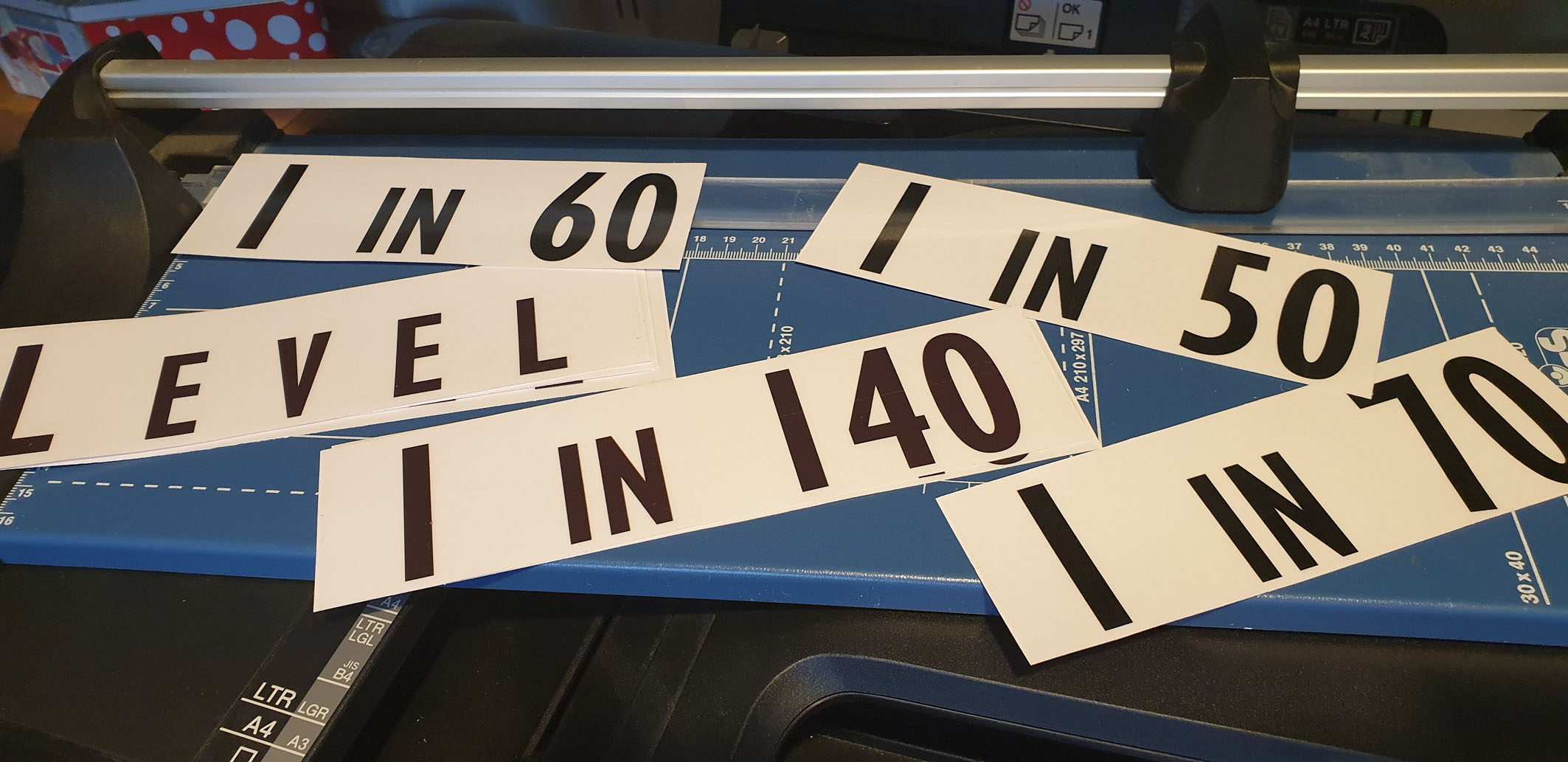 Finally, the posts were only missing the lettering. Using Microsoft WORD on my PC, I settled on a Gill Sans MT Condensed font. On ratio’s, the numbers would be 200 point, and the letters (I N) 150 point. All letters would be upper case, which matched quite closely the style shown in various photo’s I had of CR posts. Where the arm indicates LEVEL, the initial L would be 200 point, and the other letters 150 point.
The wording is printed onto Clear Vinyl A4 sheets on a standard inkjet printer. A fixer is then used to protect the ink lettering, and these are peeled and stuck to the arms as appropriate before the whole post, complete with lettering, in coated with a final coat of clear polyeurethane varnish.
 As you can see, the whole process is rather more complicated than bits of wood nailed together, but I hope you’ll find the finished product realistic, practical, safe and informative.